

Your wedding invitation is the first thing guests see, long before they arrive at your venue. It sets the tone for everything that follows, from the color palette to how formal the day will feel. A good invitation suite balances your personal style with practical details guests actually need. Below are ten wedding invitation ideas worth considering, along with what makes each one work.
Quick Answer
The best wedding invitations in 2026 mix bold typography, textured paper like vellum or linen, and colors beyond blush and ivory, such as sage green or deep terracotta. Pair the design with a clear RSVP method, whether digital or mailed, so guests respond on time.
| Invitation Style | Best For | Cost Level |
| Vellum overlay | Editorial, soft look | Caution |
| Letterpress | Formal, tactile weddings | Caution |
| Digital invite | Casual, fast weddings | Standard |
| Hand-illustrated | Personal, story-driven | Varies |
| Die-cut shape | Modern, artistic weddings | Varies |
Rough cost comparison by invitation style
1. Vellum Overlay Invitations
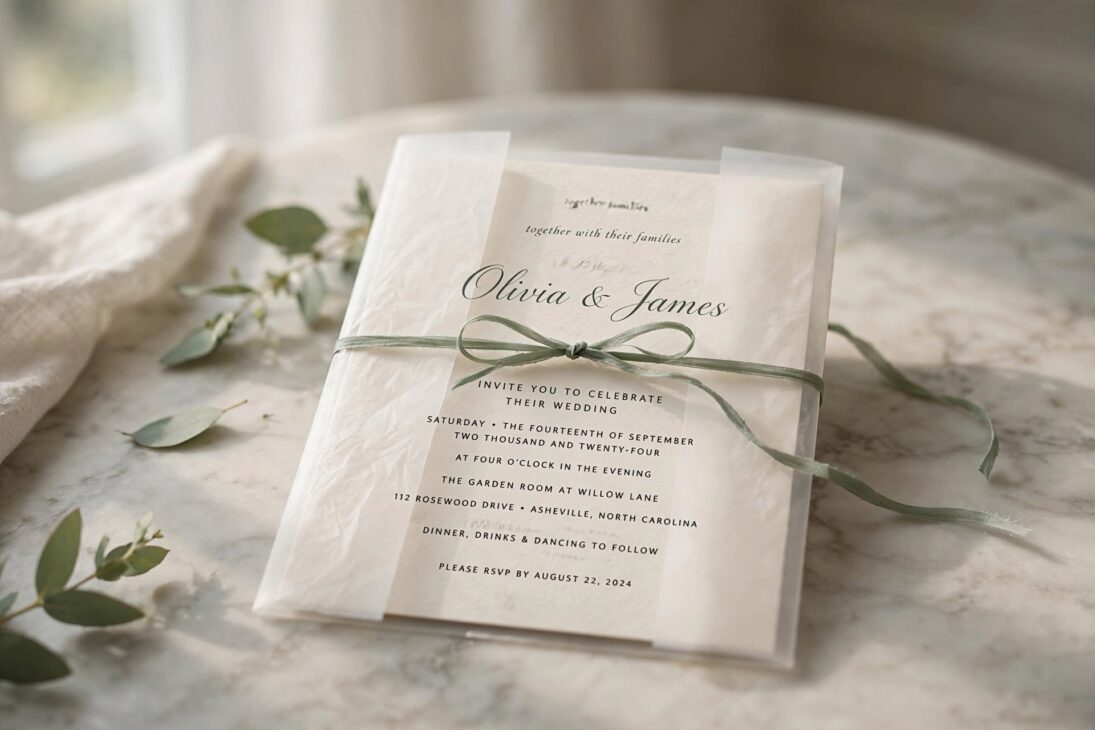
A thin, see-through sheet of vellum sits over your printed invitation, softening the text beneath while adding depth when light passes through it. This look works well for editorial or minimalist weddings, since the layered effect adds interest without extra color. Tie the vellum wrap with a thin ribbon in a color that matches your palette, sage green and dusty rose both photograph well against the frosted paper.
Vellum first became popular on social media a couple of years back, and by 2026 it has settled into one of the most requested materials for editorial-style suites. It works across warm and cool palettes alike, softening stark monochrome designs while adding depth to warmer ivory and terracotta ones.
Order a few extra vellum sheets beyond your guest count, since the material can tear or wrinkle more easily than regular cardstock during shipping or hand assembly.
2. Bold Editorial Typography
Instead of small script fonts, this style puts your names in large, magazine-style type as the main focus of the card. Clean layouts and generous white space let the typography carry the whole design. This works especially well for couples who want a modern, confident look rather than a traditional floral border.
Stick to two fonts at most, one bold display font for your names and one simple font for the details, so the card stays easy to read at a glance.
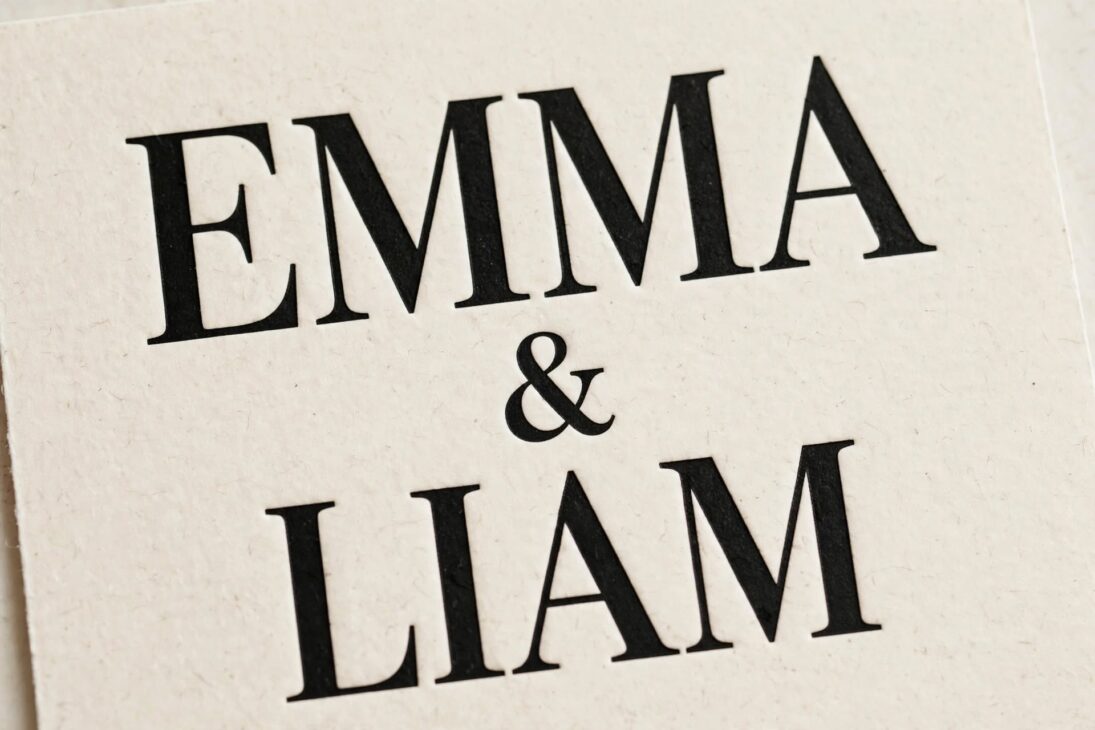
This style pairs especially well with a minimal color scheme, since the typography itself becomes the decoration. A single accent color behind your names, or a thin rule line separating the date from the venue, is often all the extra design a bold type layout needs.
3. Deep, Saturated Colors
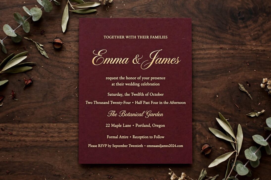
Blush and ivory are giving way to burgundy, forest emerald, cobalt blue, and terracotta. These deeper tones give your suite more personality and photograph beautifully against white tablecloths or dark venue walls. A burgundy card reads as intimate and rich, while cobalt feels modern and confident.
Pair a bold color with metallic foil lettering in gold or copper for contrast, and keep the envelope liner in a lighter shade so the card doesn’t feel too heavy when guests open it.
Deep colors also give you more flexibility with photography. A dark invitation photographed on a flat lay next to your rings and florals often stands out more in a gallery full of soft, pastel toned shots, which is part of why stationers have seen demand shift this direction.
4. Die-Cut And Arched Shapes
The rectangle card is no longer the only option. Arched tops, wave edges, and custom die-cut shapes turn an invitation into something guests want to keep rather than toss. This style suits couples planning a modern or art-forward wedding, since the shape itself becomes part of the design.
Custom shapes cost more to print and usually need a longer production window, so order these at least two months before you plan to mail them.
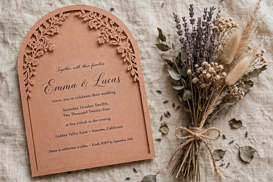
An arch shape softens the whole suite, which works nicely for garden or outdoor weddings, while a sharp geometric die-cut fits better with a modern venue like a loft or gallery space. Match the shape to the mood of your wedding rather than picking one purely because it’s trending.
5. Letterpress And Foil Texture
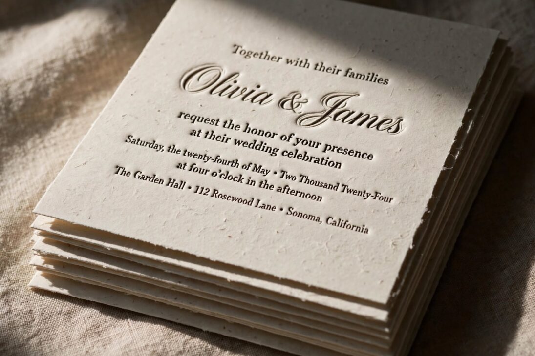
Letterpress presses text into thick cardstock, leaving a slight indent you can feel with your fingers. Foil stamping adds a metallic shine to names or a monogram. Combined, these two techniques give a card real weight and texture, the kind of detail guests notice the moment they open the envelope.
Blind embossing, pressed without ink, adds a ghosted texture that shows up only in certain light, a nice detail for a border or monogram that you don’t want to compete with the main text.
Because letterpress and foil both require special printing plates, this option usually costs more per card and takes longer to produce than a standard flat print. Budget for it early if it’s a must-have, since it’s one of the harder details to add back in later.
6. Hand-Illustrated Venue Sketches
A custom illustration of your venue, a favorite hiking trail, or even your pet gives the invitation a personal touch that a generic template can’t match. This idea works well for couples who want their stationery to tell a small piece of their story before guests even arrive.
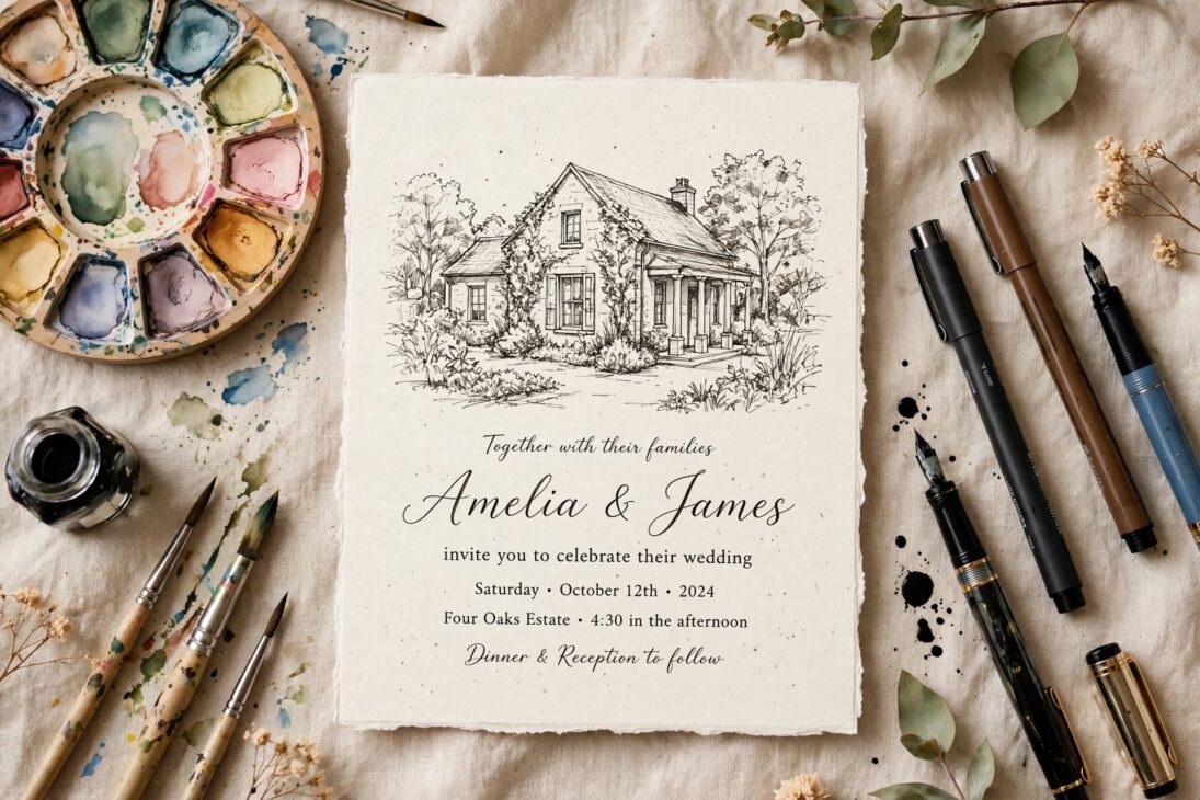
Send your illustrator clear reference photos and confirm the sketch before it goes to print, since revisions get harder once the design moves into production.
Some couples take this further and carry the illustration across the whole suite, printing it small on the RSVP card and larger on a welcome sign at the venue, which turns a single sketch into a recurring visual thread throughout the day.
7. Botanical Maximalism
Lush, layered florals on a dark background give the invitation a dramatic, painterly feel, similar to old Dutch still life paintings. This style suits fall and winter weddings especially well, where deep greens and burgundy blooms match the season’s natural colors.
Balance a busy floral design with a simple, uncluttered font for the wording, so guests can still read the date and location details without the florals crowding the text.
This style draws inspiration from old still life paintings, which is part of why it suits couples planning a wedding with a classic, formal feel, somewhere with high ceilings, candlelight, and a long dinner table rather than a casual backyard setup.
8. Hybrid Digital And Print Suites
Send a printed save-the-date and formal invitation, then handle RSVPs through a QR code or wedding website instead of mailed reply cards. This saves money on postage and paper while still giving guests something tangible to hold. It also makes tracking headcounts and meal choices much easier for you.
Print the QR code large enough to scan easily, at least an inch across, and test it on both iPhone and Android cameras before your invitations go out.
Keep in mind some older or less tech comfortable guests may still prefer a mailed reply card, so it’s worth offering a phone number or mailing address as a backup RSVP option alongside the QR code rather than relying on it alone.
9. Eco-Friendly Paper And Ink
Recycled cardstock, seed paper that guests can plant, and soy-based inks all lower the environmental footprint of your stationery without sacrificing style. Seed paper invitations, in particular, double as a small keepsake, since guests can plant the card and grow wildflowers from it.
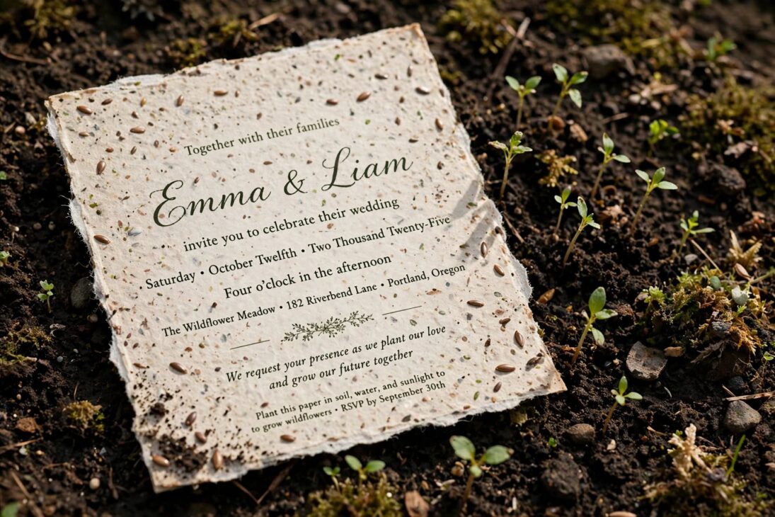
Mention the eco-friendly detail somewhere on the card or your wedding website, since most guests won’t realize the paper is plantable unless you tell them.
Recycled cardstock now comes in enough finishes, matte, textured, and even shimmer, that guests often can’t tell the difference from standard paper by look alone, which makes this an easy swap that doesn’t limit your design choices much at all.
10. Full Branded Stationery System
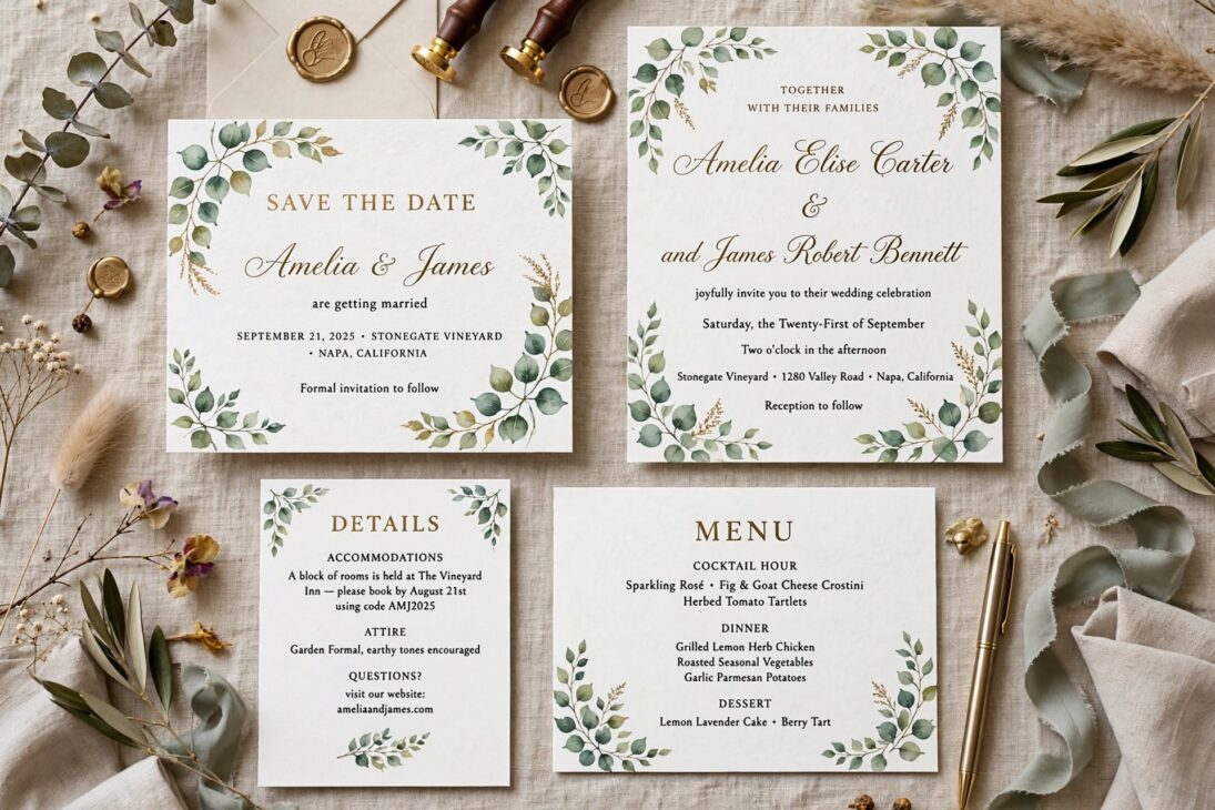
Rather than a standalone invitation, design a full suite, save-the-dates, the invitation, detail cards, signage, and menus, all using the same font, color palette, and monogram. This gives your wedding a cohesive look from the first envelope guests open to the programs they hold during the ceremony.
Design the whole system at once rather than piece by piece, since matching colors and fonts later, after your printer has moved on to other projects, often turns out slightly different from the original batch.
A full system also makes life easier for your day-of coordinator, since consistent fonts and colors on signage help guests navigate the venue without needing to ask where the bar or gift table is located.
FAQ
When should we mail wedding invitations?
Most couples mail invitations six to eight weeks before the wedding. For a destination wedding, send them three months ahead so guests have time to arrange travel.
Are digital-only invitations acceptable?
Yes, digital invitations are widely accepted, especially for casual or smaller weddings. Many couples still send a printed save-the-date first, then move RSVPs online.
How many invitations should we order?
Order by household, not by guest count, since one invitation usually covers a couple or family. Add ten to fifteen extra for last-minute additions or mistakes.
What information must be on the invitation?
Include both names, the date, start time, venue address, and RSVP method. Dress code and additional event details can go on a separate detail card instead.
References
- Paperlust, “Wedding Invitation Trends 2026: Styles Every Couple Is Loving” (2026)
- Paperlust, “2026 Wedding Invitation Trends: 10 Stationery Shifts to Watch” (2026)
- The Knot, “Wedding Invitation Trends” (2026)
- StationeryHQ, “The 10 Best Wedding Invitation Trends of 2026” (2026)

jessy
Jessy Grace has spent over 5 years researching and writing about household energy, covering everything from gas and electricity tariffs to appliance efficiency and smart meter technology. With a background in [energy consulting / utilities journalism / consumer finance], [he/she/they] specializes in breaking down complex tariff structures, regulatory changes, and cost-saving strategies into practical advice homeowners can actually use. [Author Name]'s work draws on data from official regulators, utility providers, and independent consumer bodies to ensure every guide is accurate and up to date. When not writing, [he/she/they] tests energy-saving products firsthand and stays close to industry shifts, from renewable tariffs to price cap changes, to keep readers ahead of the curve.