
Tote bags are everywhere right now, and the ones that stand out all share one thing: a clear aesthetic. If you are hunting for aesthetic tote bag design inspo, you do not need a huge design team or a fancy studio. You just need a direction and a few smart choices about fabric, print, and shape. This list rounds up 13 styles that are actually working in 2026, from soft cottagecore embroidery to sculptural slouchy silhouettes, so you can pick the one that fits your brand, your shop, or just your own closet. Whether you are sketching your first design for a small print-on-demand shop or refreshing a promotional tote line for a bigger brand, the styles below are pulled from what is actually selling this year, not just what looks nice on a mood board.
Quick answer: The most popular aesthetic tote bag design inspo for 2026 leans into three moods: quiet luxury minimalism (single-color embroidery, small icons, clean monograms), earthy retro cottagecore with a ’70s twist, and sculptural slouchy silhouettes in natural, heavier-weight canvas. Pick one mood, stick to two or three colors, and let the fabric texture do part of the work.
Quick Style Snapshot
| Style | Vibe | Best For |
|---|---|---|
| Quiet Luxury Embroidery | Standard | Everyday, gifting |
| ’70s Cottagecore | Varies | Farmers markets, spring drops |
| Graffiti Heart Prints | Varies | Younger, playful brands |
| Deconstructed Slouchy Shape | Premium | Editorial, higher price point |
| Plain Unprinted Canvas | Standard | Timeless, low production cost |
1. Retro ’70s Cottagecore
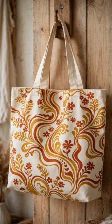
Cottagecore is still charming its way onto tote bags, but in 2026 it picks up a retro ’70s twist. Think warm mustard, rust, and cream color palettes, wavy line art, and soft floral sprigs instead of tight, symmetrical prints. This look works because it feels lived-in and warm rather than polished. It fits farmers market totes, spring product drops, and small craft businesses that want a homemade feel without looking sloppy. Pair it with a natural canvas base so the retro colors pop against the fabric.
2. Quiet Luxury Minimalist Embroidery
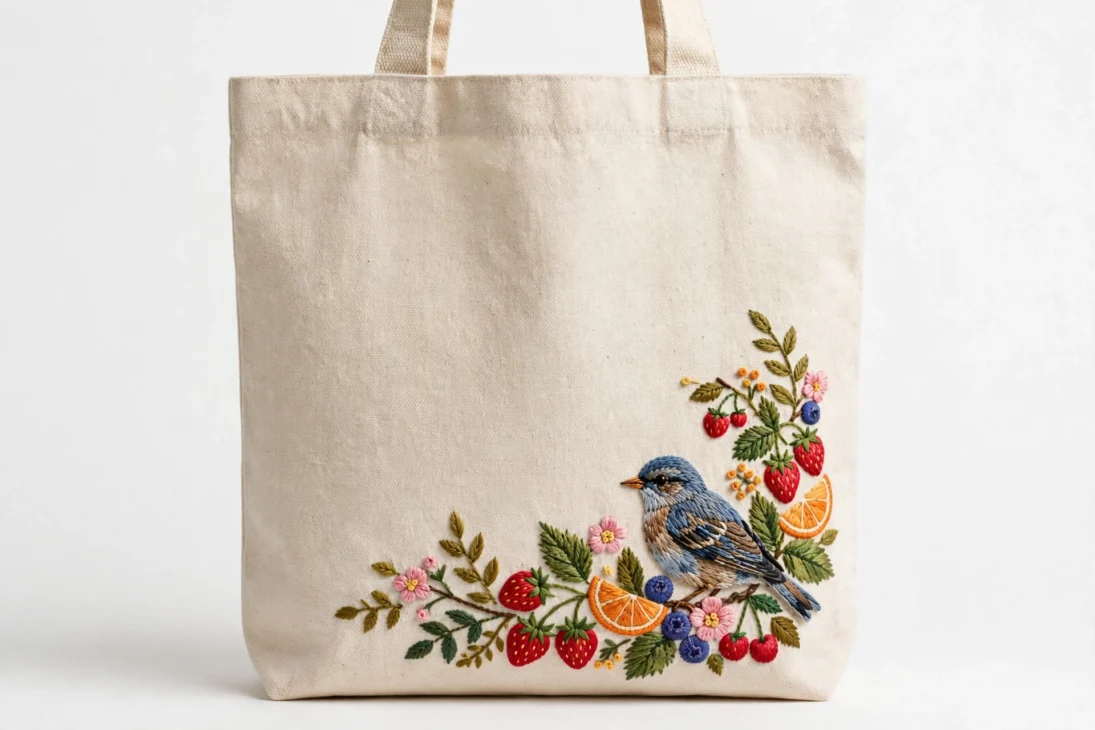
Quiet luxury has moved from clothing into bags, and embroidery is the easiest way to get the look. Instead of a loud printed logo, a single-color line drawing, a tiny icon, or a clean monogram gives a tote a much higher perceived value. Keep the thread to one or two colors and leave plenty of open space around it. This style suits customers who want something they will carry for years, not just one season, and it works especially well on organic cotton totes where the texture already feels premium.
3. Graffiti-Style Heart Prints
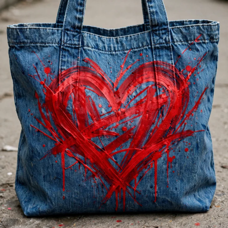
Heart prints are not just for Valentine’s Day anymore. Styled in bold color with loose, graffiti-inspired strokes, they give a tote a rebellious, romantic edge at the same time. This design direction works well on canvas or denim-look totes and pairs naturally with hand-lettered type. It is a strong pick if your audience skews younger or if you want a tote that reads as expressive rather than quiet and refined.
4. Zen Mandala and Wellness Prints
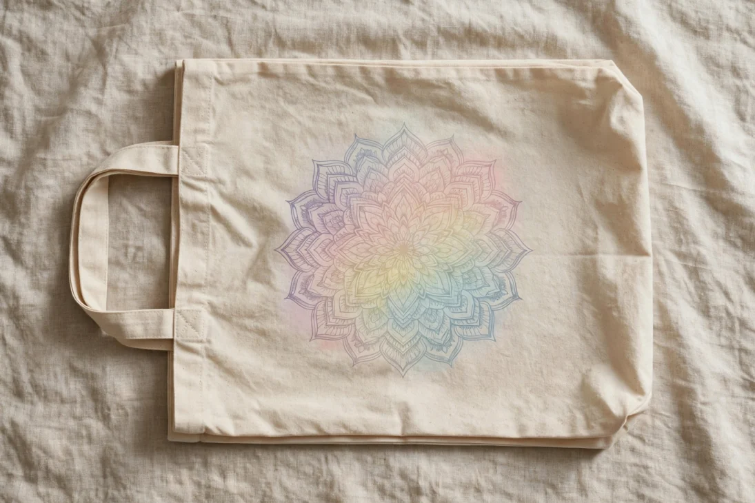
Soft gradients, geometric symmetry, and gentle illustrations like lotus flowers or mandalas give a tote a calm, intentional feel. This design channels clarity and routine, which makes it a natural fit for yoga studios, journaling brands, and wellness-focused shops. Keep the color palette soft, muted pastels or sandy neutrals work best, and let the symmetry of the pattern be the main visual interest instead of adding extra text.
5. Clean Typography and Monogram
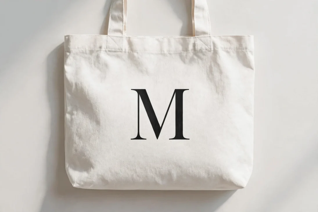
Typography is one of the biggest single design decisions on a custom tote bag right now. The right font sets the tone before anyone reads the words. A minimalist tote does not need to be plain, it just needs fewer elements used well: clean lines, neutral tones, and one simple symbol, letter, or short phrase. A well-chosen typeface can communicate a brand’s personality in a single glance, which is why so many small shops lean on typography instead of illustration.
6. Pastel Gingham Checks
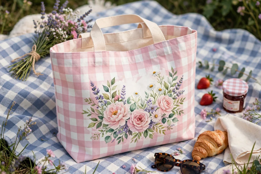
Gingham is a classic checkered pattern made of thin horizontal and vertical lines, usually white paired with one contrasting color. Layering pastel shades like pink, yellow, or lime green gives it a sweet, nostalgic feel, and a short handwritten quote on top adds personality without cluttering the design. It is an easy pattern to produce and it photographs well, which makes it popular for picnic totes, beach bags, and spring product lines.
7. Bold Checkered Patterns
Checkered patterns take the same idea as gingham but with larger, bolder squares, which gives them more edge and less sweetness. Deep tones like maroon, navy, or espresso brown make this pattern feel wearable year round instead of seasonal. Because the pattern is so graphic, it works best when the rest of the bag stays simple, plain handles, no extra print, and one accent color at most.
8. Plain Unprinted Natural Fabric
Sometimes simplicity is the style. A plain tote with no text, no graphics, and no added color lets the beauty of the fabric and the shape of the bag speak for itself. This works especially well with heavier canvas, slub cotton, or natural jute, where the texture is interesting enough on its own. It is also the lowest-cost option to produce, since there is no printing or embroidery step at all, and it never goes out of style.
9. Visible Material Storytelling
Instead of covering an organic cotton or recycled fabric bag with a full-coverage print, this trend leaves large areas of the natural material visible so the fabric itself tells the story. A small logo or icon in one corner is often all that is added. It works well for brands that want to highlight sustainable sourcing, since covering up a nice recycled fabric with heavy printing kind of defeats the point of using it in the first place.
10. Plant-Dyed Artisanal Totes
Plant-dyed totes use natural dye sources instead of synthetic color, which gives every bag slightly different, imperfect color variation. That imperfection is actually the appeal, it makes each tote feel handmade and one of a kind. This style costs more to produce and the color range is narrower than synthetic dye, but it appeals strongly to shoppers who want chemical-free, artisanal products and are willing to pay more for that story.
11. Boho Texture Aesthetic
The boho tote leans on texture more than print, think raffia, hemp, macrame trim, or woven straps. It feels grounded and tactile rather than sharp or graphic. The trick with this style is keeping the bag practical, a soulful, relaxed look only lasts if the tote still holds its shape and has enough structure to carry daily items without going flimsy. Add one or two functional details, like a zip pocket, so the look survives past the mood board.
12. Modern Utility Aesthetic
Modern utility totes are built around access and organization rather than decoration. Clean lines, sharp edges, and visible pockets or a dedicated laptop sleeve define the look. This aesthetic is popular with people who carry a lot in one bag daily, laptop, snacks, chargers, and need to find things fast. Keep the color palette neutral, black, tan, or olive, and let the structure of the pockets be the visual detail instead of print.
13. Deconstructed Slouchy Silhouette
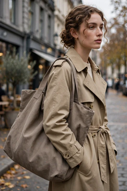
The dominant tote shape of 2026 is soft and slouchy, merging the wide-mouth utility of a classic shopper with the crescent drape of a hobo bag. This look feels editorial rather than casual, it pairs well with tailored coats and oversized blazers, giving a sleek, horizontal anchor to a sharp outfit. Because the shape is unstructured, this style works best in heavier-weight canvas or supple leather alternatives that can hold a soft drape without collapsing completely. Reinforced double straps or a single thick sculptural handle help this silhouette stay upright at the base even while the body of the bag stays relaxed, which is why so many creative-director totes use this exact combination.
How Common Each Look Is in 2026 Tote Drops (Relative Popularity)
How Do You Pick the Right Aesthetic for Your Tote?
Start by picking one mood, not three. A tote that tries to be boho, minimalist, and graffiti-inspired all at once ends up looking confused instead of styled. The fastest way to narrow it down is to think about who is carrying the bag and where. A laptop-carrying commuter wants modern utility. A farmers market shopper wants cottagecore. A gift buyer wants quiet luxury. Once you know the person, the design almost picks itself.
Next, match the fabric to the aesthetic before you touch color or print. Heavier canvas, around 340 grams per square meter or more, holds structure well and suits utility and slouchy silhouette styles. Lighter, softer cotton drapes more naturally and works better for boho texture or plant-dyed looks. Jute and hemp blends bring in the raw, natural texture that visible material storytelling depends on. Choosing the wrong fabric for the aesthetic is one of the most common mistakes, a stiff heavy canvas will never slouch the way a soft cotton blend does, no matter how the pattern is cut.
Then decide how the design goes on the bag. Embroidery reads as premium and lasts through years of washing, which fits quiet luxury and monogram styles. Screen printing is cheaper and works well for bold graphic looks like checkered patterns or graffiti hearts. Natural dye, including plant-based dye, suits artisanal and cottagecore aesthetics but costs more and limits the color range. Match the production method to the budget and the story you want to tell, not just the look in a reference photo.
Finally, think about function before you finalize the design. A tote that looks stunning in a photo but has no pocket for keys or a phone will frustrate the person carrying it within a week. Even a fully plain, unprinted canvas tote benefits from one interior pocket. Adding reinforced stitching at the stress points, especially where the handles meet the body of the bag, keeps a slouchy or boho tote from tearing under daily use. A design only earns its place in someone’s daily rotation if it survives being used, not just photographed.
FAQ
What is the most popular tote bag aesthetic right now?
Quiet luxury minimalist embroidery is one of the strongest trends right now. It uses a small, single-color icon or monogram instead of a loud printed logo, which gives a plain canvas tote a much higher perceived value.
Do aesthetic totes need to be expensive to make?
No. A plain, unprinted natural canvas tote is one of the cheapest styles to produce since it skips printing and embroidery entirely, and it still reads as a clean, intentional design choice.
What colors work best for a 2026 tote design?
Earth tones and neutrals like tan, olive, rust, and cream are leading the year, alongside soft pastels for gingham-style designs. Stick to two or three colors so the design stays clean.
Should I choose a print or a plain design?
It depends on your audience. A print adds personality fast, which suits younger or trend-driven shoppers, while a plain or lightly embroidered tote suits buyers who want something timeless they will carry for years.
References
- Gelato, “7 Tote Bag Inspo Ideas for Spring & Summer 2026” (2026)
- Printful, “30+ Fresh Tote Bag Design Ideas for 2026” (2026)
- RareCustom Blog, “Custom Tote Bag Design Guide: Trends and Ideas for 2026” (2026)
- Urban Totes, “Discover Your Tote Bag Aesthetic: 8 Styles for 2026” (2026)
- Spantik Textiles, “The Ultimate Tote Bag Guide: Styles, Trends & What’s Driving Demand in 2026” (2026)
- Cocotaya BAG, “Tote Bag Trends for Women 2026: Materials, Silhouettes & Must-Have Shades” (2026)

jessy
Jessy Grace has spent over 5 years researching and writing about household energy, covering everything from gas and electricity tariffs to appliance efficiency and smart meter technology. With a background in [energy consulting / utilities journalism / consumer finance], [he/she/they] specializes in breaking down complex tariff structures, regulatory changes, and cost-saving strategies into practical advice homeowners can actually use. [Author Name]'s work draws on data from official regulators, utility providers, and independent consumer bodies to ensure every guide is accurate and up to date. When not writing, [he/she/they] tests energy-saving products firsthand and stays close to industry shifts, from renewable tariffs to price cap changes, to keep readers ahead of the curve.